Meaning of Responsive Web Design

Simple definition

Responsive web design ensures that websites adapt seamlessly to different devices and screen sizes, providing an optimal user experience everywhere.

How to use Responsive Web Design in a professional context

Responsive design is essential in modern web development to create mobile-friendly and accessible websites, which is a key factor in SEO and user engagement.

Concrete example of Responsive Web Design

A blog website uses media queries in CSS to switch from a multi-column layout on desktops to a single-column layout on smartphones.

What are media queries in CSS?

Media queries allow you to apply styles based on device characteristics like screen width or resolution.

Is responsive design only about mobile compatibility?

No, it’s about creating an optimal experience on all devices, from small phones to large monitors.

Do I need responsive design for my website?

Yes, as most users access the web via mobile devices, responsive design is crucial.
Related Blog articles
Alexandre, bridging the technical gap at Revolut

Alexandre, bridging the technical gap at Revolut

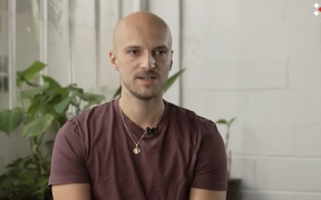
Alexandre works in sales at Revolut. When clients ask technical questions, he doesn't need to...

How to upskill in tech without quitting your job: Le Wagon Canada’s part-time bootcamp

How to upskill in tech without quitting your job: Le Wagon Canada’s part-time bootcamp

You want to move into data, AI, or tech — or deepen the skills you...

Arthur: From lawyer to AI developer at Ubisoft

Arthur: From lawyer to AI developer at Ubisoft

When Arthur graduated from law school after five years of study, the professional world didn't...

      Suscribe to our newsletter

      Receive a monthly newsletter with personalized tech tips.