Meaning of Flexbox

Simple definition

A CSS layout module that makes it easier to design flexible and responsive layouts, aligning items in rows or columns.

How to use Flexbox in a professional context

Widely used by web developers to manage spacing, alignment, and distribution of elements, especially for layouts that adapt seamlessly to different screen sizes.

Concrete example of Flexbox

A developer uses Flexbox to center a navigation menu horizontally and vertically, ensuring it stays responsive on both desktop and mobile screens.

What is the main advantage of Flexbox?

It simplifies aligning and distributing space between items in a container.

Is Flexbox better than CSS Grid?

They serve different purposes: Flexbox is best for one-dimensional layouts (rows/columns), while Grid handles two-dimensional layouts.

Can I use Flexbox with older browsers?

Most modern browsers support Flexbox, but older versions may require prefixes or fallback solutions.
Related Blog articles
Why a Google Solutions Architect Joined our Data Science and AI Bootcamp

Why a Google Solutions Architect Joined our Data Science and AI Bootcamp

AI, automation and data science are reshaping the tech industry. In this interview, Google Solutions...

Christelle: A geneticist becomes a data scientist

Christelle: A geneticist becomes a data scientist

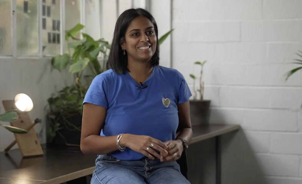
Christelle has a PhD in genetics. In April 2024, she did Le Wagon's Data Science...

Bring Your Idea to life. Leave with a Working Product and AI skills 🚀

Bring Your Idea to life. Leave with a Working Product and AI skills 🚀

Build AI-powered software from idea to launch with our practical AI Course. Learn by creating...

      Suscribe to our newsletter

      Receive a monthly newsletter with personalized tech tips.