Accueil > Skills > 5 steps to build your first landing page
5 steps to build your first landing page
Are you looking to build your first landing page but don’t know where to start? We understand that there is a lot to think about, from choosing the right tools to use, to planning the design and code structure of your page. To help out, we have deduced the process to five simple steps, so you can build your first landing page today. Read on to find out more!
Summary
Stay on top of the latest tech trends & AI news with Le Wagon’s newsletter
The purpose of a landing page is to promote your brand and to convert users into potential customers. It is the entry point into your site and acts as a snapshot into what your brand is all about. We all know how important first impressions are, which is why your landing page should be clear, informative and impactful. With so much to think about before we even begin to code, it is often difficult to know where to start. To help out, we have deduced the process to five simple steps, so you can build your first landing page today.
Step 1. Get set up and put pen to paper
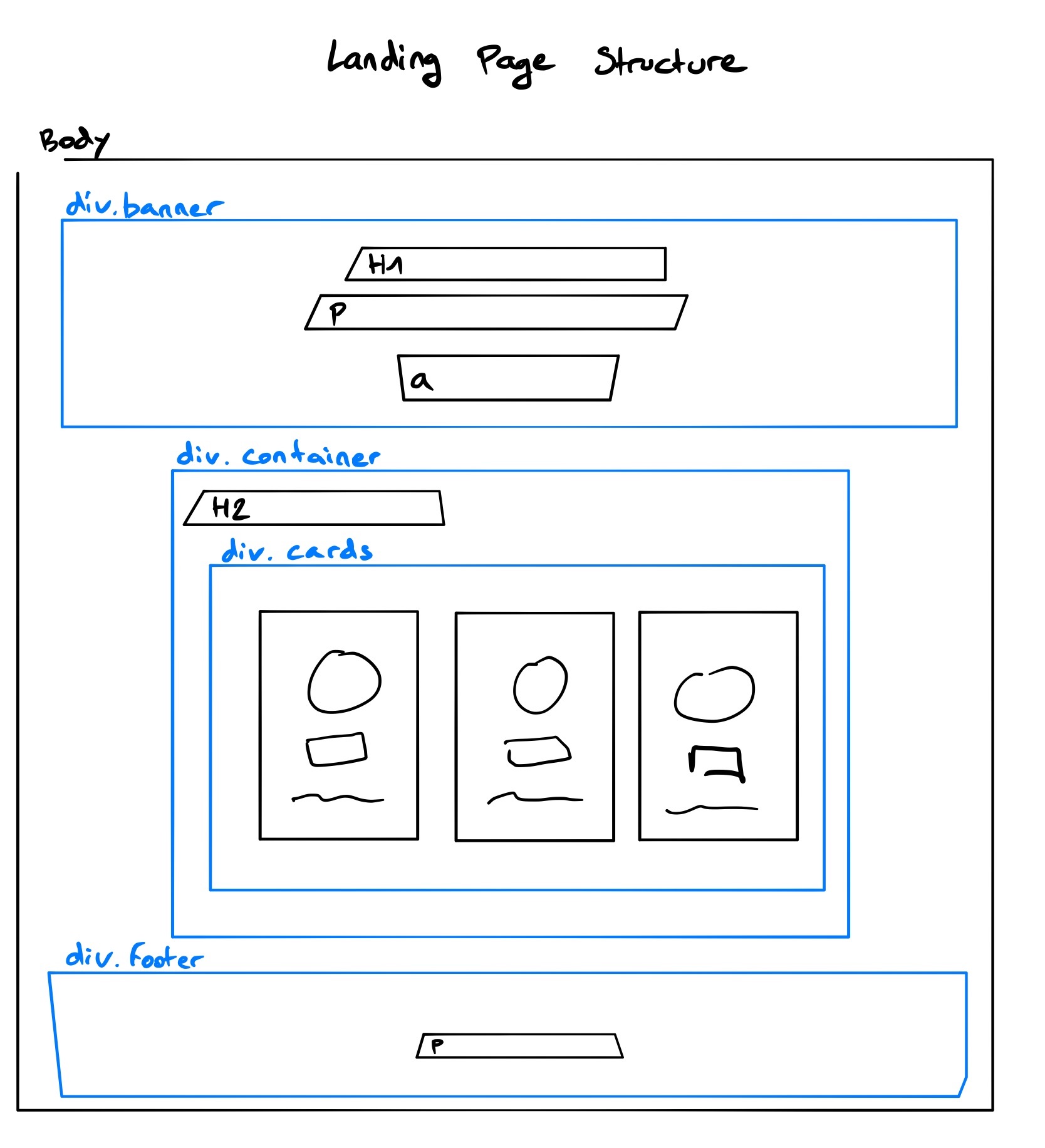
Having the correct set up before you start coding is extremely important. The set up not only includes downloading a trusty text editor, but also planning the outline of your page. We recommend Sublime Text as a text editor, as it has great features such as auto-completion and syntax highlighting, which makes learning to code a whole lot easier (and prettier!) Next, think about the structure of your page and how you want it to look. Break down your ideas into sections and draw these blocks onto a piece of paper to help create the skeleton of what you’ll be building. This quick sketch will come in very handy for Step 2! Don’t forget to download a browser such as Chrome (the developers’ favourite). You’ll need this to display your code and will allow you to test as you go along and make quick edits to your code. Below is an example of a rough skeleton sketch.Rough skeleton sketch
Step 2. Bring your skeleton sketch to life
Although HTML is not the most aesthetically pleasing without CSS, a clean structure is intrinsic in building a beautiful landing page. The HTML document is broken up into two parts; <head></head> and <body></body>. The <head> stores the page’s intelligence, whereas the <body> holds the structure and content. For a clean structure, each section from your skeleton sketch should be encased in its own <div> tag. Feel free to add classes to these <div> tags, so you can target them individually and add specific CSS styling. (We’ll get to styling in Step 4!) Remember to use header and paragraph tags when adding your text. This will add structure to your content and make important text elements stand out throughout your page. See below for an example of a top banner section enclosed in a <div> tag with a banner class, which holds a header tag, paragraph tag and call to action link.
<div class="banner"> <h1>Change your life, learn to code</h1> <p>Le Wagon brings technical skills to creative people</p> <a href="https://www.lewagon.com" target="_blank" class="btn-blue">Apply now</a> </div>
Step 3. Add some impact
Now that your structure and content are in place, your site is beginning to take shape. However, a user can be easily put off by too much text, which is why adding impactful images can help engage users and transform your site. Using carefully selected images is a powerful way to evoke positive emotions and communicate your brand’s message to potential clients. Landing pages often have a banner section with a large background image and text overlayed at the top. The goal is to attract the user’s attention to the call to action and make them want to find out more about your brand and site. Using high quality images is important, but don’t worry if you’re not a photographer yourself, you can use sites such as unsplash.com to find what you need.
Step 4. Let’s style it up
CSS is what we’ll use to jazz up our HTML skeleton structure from Step 2. Before coding, think about who your target audience is and how this will affect your design. We recommend using no more than three colours for your entire site; one dominant colour, which is associated with your brand, and two complimentary colours to create your colour scheme. Don’t worry if you’re not a confident creative, fortunately there are great tools to help you out, such as colorhunt and coolors. Consistency is key when it comes to styling, not only in your choice of colours, but also your fonts. Having a maximum of two different fonts for your headings and paragraph text will ensure continuity throughout your site and make your brand more believable and attractive. Google fonts are free, easy to use and have an eclectic mix of styles. Remember, if you added classes to your HTML sections in Step 2, you can now add individual styling to these in your CSS. Below is an example of CSS styling for the banner class that we created in Step 2, with an example of implementing an impactful image background from Step 3.
So far we have built the page structure in HTML, added impactful images and styled it up with CSS. Although it looks great on desktop, without any media queries your site will probably look a little wonky on mobile. Nowadays, mobile devices are responsible for a huge percentage of web traffic, which is why making your landing page responsive for smaller devices is so important. Adding media queries to the CSS file allows us to tailor the behaviour of elements depending on the size of a user’s device. This ensures a good user experience, regardless of what device they're on. For example let’s say you only want to have one column instead of three for your cards’ grid on mobile and tablet, you can add the below to your CSS:
This means that when the browser screen size is under 800px, the below style rule will be applied. You can add different styling rules to multiple breakpoints. Below is a breakdown of device widths that you can use as a template for your media query styling:
// Smallest device @media (min-width: 100px) and (max-width: 575px) { // CSS for this breakpoint } // Small devices (landscape phones, 576px and up) @media (min-width: 576px) { // CSS for this breakpoint } // Medium devices (tablets, 768px and up) @media (min-width: 768px) { // CSS for this breakpoint } // Large devices (desktops, 992px and up) @media (min-width: 992px) { // CSS for this breakpoint } // Extra large devices (large desktops, 1200px and up) @media (min-width: 1200px) { // CSS for this breakpoint }
Take time to plan the design of your landing page and draw out a clear structure of how you envisage the finished page to look. This clear foundation combined with meaningful images and consistent styling will give you the perfect recipe for a powerful page. By breaking the process down into these five steps, you’ll soon be well on your way to building your first landing page.
If you enjoyed this article, check out our blog for even more articles about a wide range of topics!